 The latest show by Corrine Smith, running through March 9 at the Morrissey Gallery inside St. Ambrose University's Galvin Fine Arts Center, is a chance to see some exciting new color explorations by a painting and collage powerhouse. She has incorporated a wider range of bolder colors that have invigorated her powerful images with even more visual octane.
In the sense of upheaval and breaking with tradition, none of these works is revolutionary in the context of Smith's oeuvre. But many of her new works are definitely evolutionary.
Her characteristic asymmetrical arrangements - featuring intricate dialogues between partially overlapping circles, ovals, and rounded geometric forms - are still her basic building blocks. However, many of her newer works resonate with a tantalizing crispness due to higher tonal contrast, a broader palette of colors, a denser concentration of forms, and more pronounced textural elements.
Smith's previous use of color was by no means timid. She would frequently play with two or three colors per composition - exploring slight variations in color by adding grays or a complementary color (which lies opposite on the color wheel and gives a brownish-gray quality to the original color) or analogous colors (which are colors that lie on either side of a color on the color wheel) to shift her basic hue.
Rick #9, Gateway, Plates #19, and the two Mini-Series showcase the transitional breadth of Smith's skillful use of color, her ability to cultivate dynamic compositions, and her knack for tightly weaving positive and negative shapes together. (Positive shapes are the objects or forms created by an artist within a composition, while the negative shapes are the areas that surround them. The negative spaces should not be considered "leftovers"; they are as integral to the composition as the positive shapes.)
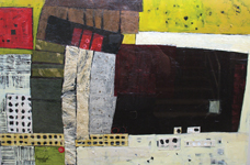
Rick #9 has an earthy color palette and a subdued sense of value contrast that recalls many of Smith's previous works. The complex visual activity lies horizontally across the center like a loosely pulled accordion of mismatched rectangles composed of muted tones waiting to be squeezed into a Technicolor sandwich filled with earthy yellows, dulled purples, and peach passages. This sideways rick of forms is surrounded by textured and surprisingly warm blue-greens above and olive drab below.
The green negative spaces that sneak into portions of the "accordion" are rich with brush strokes and texture of their own. This heightens the relationship between positive and negative spaces, as both areas at times assume opposite roles. The tight integration of positive and negative space is key to crafting a dynamic composition, and Smith continually seeks out new ways to accomplish this visual dance.
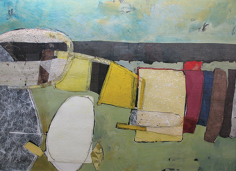 Gateway has a rich and satisfying subdued steel blue set upon by an uplifting arc of butter-cream yellow and small rectangles of lemon, golden orange, and Doritos orange.
The different passages of color stand vertically nearly shoulder-to-shoulder. While there is natural movement side-to-side between these "stripes," there is far more effervescent activity vertically within each "stripe" due to the internal textures. Smith's use of light and dark contrast throughout Gateway helps define the various forms and energize the piece. The slight texture found within the dominant thick blue is quite captivating because of the way it is played against the smaller variations of yellow/orange that continually solicit re-observation from the viewer.
Plates #19 is a sophisticated work that plays opposites against each other and establishes dialogues between shapes, colors, values, and movements. The left half operates as a staccato-like inhalation with stacks of rectangles, two autonomous patches of attention-demanding color, and a dynamic form laden with tightly packed contrasting values of thickly painted white slashes over a darkened violet base.
The lower color is a square of pale avocado green that helps energize the candy-apple-red passage near the top left, which is partially surrounded by a honey-mustard yellow that plays referee between the two contrasting colors. The yellow helps activate the comparatively calm right side of the work, which serves as a visual exhalation before being drawn back toward the towers of plant fibers that support a black form that threatens to slide off into the warm, tar-like void that fills most of the right side. Creating a satisfying sense of balance by playing opposites off of each other is (a) trademark Corrine Smith and (b) difficult to pull off successfully.
Many familiar visual motifs recur in the two Mini-Series pieces (each consisting of four panels): leaning stacks of rectangles that generate a sense of anticipation, and clusters of overlapping ovals and textural relationships used to draw the eye around the work. Smith infuses a newness with her bolder color scheme and punchier contrast.
These two-by-two-panel arrangements are thick with collage and have a much denser dialogue of forms throughout than is typically found in Smith's earlier and airier compositions. The most noteworthy visual rest is found outside of the panels in the white "plus" on the wall formed between the pieces.
All of Corrine Smith's work utilizes and expands upon axioms of design such as repetition of similar forms and colors, division of the picture space into thirds, and the use of contrasting or opposite colors, shapes, and values to lead the eye around the composition. But her work is far beyond rote incorporation of "required" ingredients, and she has internalized and expanded these principles to make compositions work in new and exciting ways.