In the Hatch Show Prints exhibit in St. Ambrose University's Catich Gallery, the past and present intermingle through design. Art, design, and culture don't move forward in a linear way; instead, they diverge, change, and return as new but still familiar styles. Typefaces from almost a century ago manage to look fresh in the hands of a modern designer, and a poster from the 1950s can seem almost prophetic in its similarity to today's graphics. By presenting designs of the past alongside new designs with a retro bent, Hatch Show Prints reveals the connections between history, culture, and design, and their relationships to music and performance.
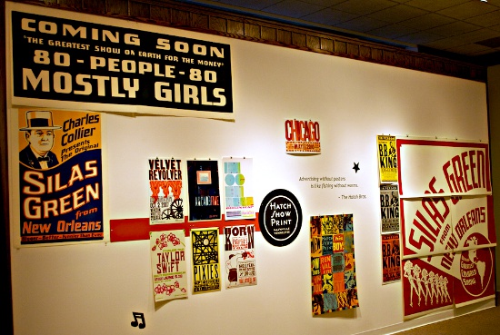
This show, in the Galvin Fine Arts Center, is a powerful assemblage of 58 letterpress block prints, all made by the Hatch Show Prints print shop in Nashville, Tennessee. The shop opened in 1879 and has created promotional posters for performers of all sorts, and this exhibit includes fresh prints made from eight decades of archived blocks. In recent years, shop manager Jim Sherraden has also made monotypes by combining the old blocks in new ways, and a selection of his original works is also on display.
The show samples widely the Hatch collection, although the majority of the posters are for modern music acts including B.B. King, Carrie Underwood, Johnny Cash, the Pixies, and Dashboard Confessional. The posters range in size from about the size of a sheet of legal paper to 26-by-40-inch designs and were all printed in the past eight years. The exhibit was a clever choice for a university audience, highlighting printmaking techniques and design history coupled with popular music.
The exhibit creates the atmosphere of a county fair, or a busy city street plastered with signs. Text in an image always begs to be read, and standing among so many visually bold words is like trying to pick out a single voice in a crowd; this exciting and bewildering effect is heightened by the use of bright colors, bold shapes, and diverse typefaces. The prints are left unframed, making it feel like the posters are in their natural environment, but they're hung in precisely aligned clusters and grids on white walls, which brings about a sense of order. The Catich achieves a pleasant balance between art gallery and poster wall, which allows the viewer to contemplate the works without being overwhelmed, while still feeling their original intent.
It's striking how well the Hatch designers visually capture the sounds and personae of the artists. The color scheme of the Taylor Swift poster is pastel green and pink - two currently popular colors for young girls - and the text is framed in cherry blossoms. The visible grain of the woodblock creates a down-home feel perfect for a country artist.
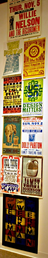
A different use of the letterpress method can be seen in the poster for the heavy-rock group Korn. The poster includes a vintage block print of a boxer that has been made even tougher by layering new prints of blood splatter on the gloves and a tattoo of a skull on the fighter's shoulder. Even though the typeface and boxer image are clearly from a design era of the past, these modern updates make clear the alternative edge of the band.
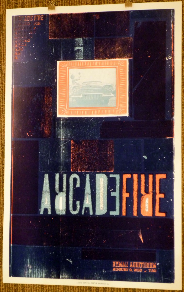
The woodcut medium was embraced and emphasized by the designers for some of the pieces. The Arcade Fire concert poster, for example, has an inked surface that appears faded, smudged, and cracked from gouges in the wood used to create the image. The edges of the typeface are fuzzy, but at the top of the poster we see a sharp vintage photograph of a woman, standing by a car, holding a baby. The use of the old photograph with an intentionally flawed printing method for a contemporary band is a visual potpourri. However, the designer's use of symmetrical organization, a solid dark-blue background, and a limited color palette hold the work together. And again, the visual choices reference the musical style of the performers. The Arcade Fire's sound draws on the past through the use of folk and romantic musical motifs, which mesh well with the aged appearance of the poster.
Other designs seem so clean and precise that the viewer might at first mistake them for digital or screen prints. A poster for singer/songwriter Melissa Etheridge features an open, ecru background, with simplified slender trees in the foreground. The clean edges and solid color of the shapes, as well as the contemporary aesthetic with which this was created, look much more like a work of digital vector art than a woodcut. This combination of a modern aesthetic within a traditional mode of production draws on Etheridge's musical style of gruff vocals with slick pop production. Though this print communicates successful, its avoidance of the imperfect nature of the letterpress method robs it of some character; the most compelling prints in this show could not have been created through another medium.
While the juxtaposition of old materials and a modern sensibility is a persistent motif in the show, Jim Sherraden's monotypes combine them in the context of fine art rather than design. His monotypes were made by running the paper through the press several times over different arrangements of blocks, with ink expressively hand-applied. The result is a hybrid of painterly textures with flat, graphic type and pictures. Sherraden's disciplined fusion of seemingly unrelated prints - with disparate images, letters, and textures - results in a beautiful interplay.
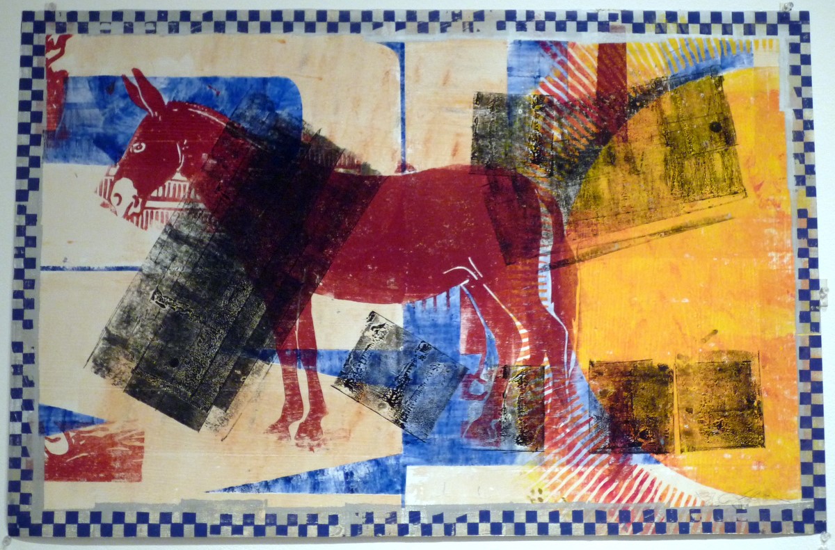
In one print, Sherraden has placed a large donkey in the center of the composition. The background is a patchwork of light yellows and blues, with a faint red sun running off the right side. Overlapping all this are blotchy black rectangles, with the ink lightly applied so that the background remains faintly visible beneath. These were printed from blocks, but the ink is too sparse or smudged to make out what the block originally depicted, creating a mysterious texture. All of this is contained in a checkerboard border, suggesting a race victory flag, chess, or a clothing pattern. The sun and the use of warm colors bring to mind summer. The donkey can be associated with many things - the Southwest, farming, carrying loads, or even the Democratic party. Like the posters, this print seems to be a memory - an elusive scrap of the past viewed through the aesthetic of the present.
Michelle Garrison is a mixed-media artist who teaches art and design at Geneseo Middle School and J.D. Darnell High School. She can be reached at michelle_m_garrison@hotmail.com.